12 Common Website Mistakes Kenyan Businesses Must Fix
Stop losing leads to slow load times, poor mobile UX, and broken forms. The 12 most critical website errors Kenyan SMEs make and how to fix them.

A business can spend KES 50,000 on a website, pay for Google Ads, post consistently on social media and still receive weak enquiries.
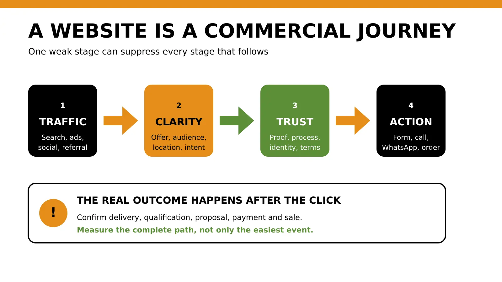
The problem may not be traffic. It may be what happens after a potential customer reaches the website.
The page opens slowly. The headline says nothing useful. The service area is unclear. The WhatsApp button opens without context. The contact form fails silently. Testimonials look anonymous. Nobody knows which enquiries came from search, advertising or referrals. Management concludes that digital marketing does not work, even though the website is breaking the journey before sales gets a fair chance.
That is the commercial danger of common website mistakes. Each one appears small in isolation. Together, they can waste acquisition budget, weaken trust and make a credible business look difficult to buy from.
This guide shows Kenyan business owners what to inspect, why each mistake matters and what to fix first.
Quick answer
The most damaging website mistakes Kenyan businesses make are failing to define the website’s commercial goal, using vague messaging, hiding important services, neglecting mobile usability, allowing slow or unstable pages, presenting weak trust evidence, using confusing calls to action, leaving forms and WhatsApp journeys untested, ignoring search fundamentals, failing to measure real outcomes, mishandling personal data and launching without a maintenance process.
Do not begin by changing colours or redesigning every page. Test the complete customer journey, identify the failure closest to revenue, repair that constraint, and then measure whether qualified enquiries improve.
Key takeaways
- A website should help a specific visitor complete a specific business action.
- Clear offers and next steps matter more than decorative complexity.
- Mobile testing must include forms, WhatsApp, calls, booking and payment journeys.
- Search visibility depends on accessible, indexable and useful content, not keyword repetition.
- A button click is not automatically a lead, booking or sale.
- Trust signals must be specific, verifiable and placed near the decision.
- Forms that collect personal information need a clear purpose and appropriate privacy controls.
- Website maintenance is an operating responsibility, not a one-time launch task.
- Prioritise broken journeys and misleading information before visual polish.
Mistake 1: Treating the website as an online brochure
Many websites are built to prove that the business exists. They contain a logo, an About page, a list of services and contact details. They do not help a visitor make a decision.
An effective business website needs a defined commercial job. That job may be to:
- generate qualified quotation requests;
- secure consultation bookings;
- sell products;
- drive calls for urgent services;
- start structured WhatsApp conversations;
- collect applications;
- support an offline sales process;
- explain a complex offer before a proposal meeting.
Without a primary job, every department asks the website to do something different. The homepage accumulates banners, announcements, service cards, social feeds, newsletter forms and multiple buttons. The visitor sees activity but no clear path.
What to fix
Write one sentence before changing the design:
This website helps [specific audience] choose [specific offer] and take [specific next action].
For example:
This website helps Nairobi property managers compare commercial cleaning packages and request a site assessment.
That sentence gives the website a decision rule. A social icon or animation is useful only if it helps the visitor understand, trust or complete the intended action.
If the business has several audiences, define one primary journey per important page. Do not force every visitor through the same generic homepage.
Mistake 2: Using vague homepage messaging
“Welcome to our website.”
“Your trusted partner.”
“Innovative solutions for a better tomorrow.”
These statements are not necessarily false. They are commercially weak because they do not explain what the company does, who it serves, where it operates or why the visitor should continue.
A first-time visitor should not need to study the navigation to understand the business.
A stronger opening message
A useful first screen normally answers four questions:
- What does the business provide?
- Who is it for?
- Where is it available?
- What should the visitor do next?
Weak:
Building better futures.
Stronger:
Commercial solar installation for factories and warehouses across Kenya. Request a site assessment.
Weak:
Quality healthcare you can trust.
Stronger:
Book outpatient and specialist appointments at our Westlands clinic. Call or reserve your appointment online.
The stronger versions are not clever slogans. They reduce uncertainty.
What to fix
- Replace generic claims with the service, audience and useful outcome.
- Add location only when it affects availability or buyer intent.
- Support claims with evidence elsewhere on the page.
- Use the customer’s language instead of internal department names.
- Remove unsupported words such as “best,” “leading” and “number one.”
Mistake 3: Making services and locations difficult to understand
A business may offer five valuable services but give them only one sentence each on the homepage. Search engines receive little context. Buyers cannot compare options. Sales receives enquiries from people who misunderstood the offer.
The opposite problem also occurs. A company creates dozens of near-identical city pages for Nairobi, Mombasa, Kisumu, Nakuru and Eldoret even when the service and proof are the same. The pages exist for keywords rather than customers.
What good service structure looks like
Create a dedicated page when a service has its own:
- buyer need;
- search intent;
- delivery process;
- decision criteria;
- objections;
- price factors;
- proof;
- next action.
A law firm should not hide corporate law, conveyancing and employment law inside one “Our Services” paragraph. A manufacturer should not combine home-gym equipment, commercial gym setup and equipment maintenance into one generic page if each buyer needs different information.
Location clarity
State where the service can genuinely be delivered.
- A Nairobi clinic should identify its actual branch and booking options.
- A Mombasa logistics provider should explain the routes and facilities it serves.
- An ecommerce store should clarify nationwide delivery, charges and timing.
- A consultant serving East Africa should explain whether work is remote, on-site or market-specific.
Location pages should contain real local information, not swapped city names.
Mistake 4: Designing for desktop and checking mobile later
Website reviews often happen on a designer’s laptop. Customers may arrive on a phone, using mobile data, while moving between Google, the website, M-Pesa and WhatsApp.
Google uses the mobile version of a site’s content for indexing and ranking and recommends responsive design as the easiest mobile-friendly pattern to implement and maintain. Review Google’s mobile-first indexing guidance.
A page can technically “fit” on a phone and still be difficult to use.
Common mobile failures
- the headline wraps into an unreadable block;
- the WhatsApp button covers another control;
- the menu is difficult to open or close;
- form fields use the wrong keyboard type;
- the keyboard hides the submit button;
- text is too small;
- tap targets are crowded;
- pop-ups block the main content;
- tables overflow the screen;
- payment or booking context disappears after a redirect;
- important content exists on desktop but is hidden on mobile.
What to test
Use real phones where possible. Complete each important journey from the first page to confirmation:
- arrive from search, an advert or a social link;
- understand the offer;
- open the relevant service or product page;
- tap the primary action;
- complete the form, call, WhatsApp, booking or checkout step;
- receive a clear confirmation;
- verify that the business receives the information.
Tabala’s mobile SEO and conversion guide provides the narrower mobile review after this broader diagnosis.
Mistake 5: Ignoring speed and technical reliability
A slow page is not only an inconvenience. It delays every message, proof point and conversion action on the page. A visually unstable page can also cause someone to tap the wrong control.
Google’s Web Vitals guidance identifies Core Web Vitals that represent loading performance, interactivity and visual stability. These measurements are useful because they describe parts of the experience a visitor can feel.
Speed scores should not be treated as a trophy. The business goal is a reliable journey.
Common causes
- oversized hero images;
- uncompressed product galleries;
- too many third-party scripts;
- slow hosting;
- unused plugins;
- heavy page-builder components;
- broken caching;
- render-blocking fonts and scripts;
- unstable banners or pop-ups;
- scripts that fail before forms or menus initialise.
What to fix first
Start with pages that receive traffic or support revenue:
- homepage;
- important service pages;
- campaign landing pages;
- product and category pages;
- checkout;
- booking;
- contact and quotation pages.
Test the page on a slower connection and a mid-range phone, not only office Wi-Fi and a new laptop.
For crawling, indexing, structured data, broken URLs and performance checks, use the technical SEO checklist for Kenyan websites.
Mistake 6: Using confusing navigation and page structure
Navigation should help a visitor find the next useful page. It should not expose the company’s entire internal structure.
Common navigation problems include:
- vague labels such as “Solutions,” “What We Do” and “Explore” without context;
- menus with too many equal choices;
- important services hidden under several levels;
- different labels for the same service;
- broken links;
- pages with no useful route forward;
- a blog that never links to services or diagnostic tools;
- a homepage logo that does not return to the homepage;
- footer links that contradict the main navigation.
Structure each page for scanning
Most readers scan before reading deeply. Use:
- one clear H1;
- descriptive H2 sections;
- short paragraphs;
- meaningful lists;
- comparison tables where useful;
- links that name the destination;
- repeated CTAs at logical decision points.
Every important page should be able to welcome a visitor who did not enter through the homepage. Explain the context, establish trust and provide a next step.
What to fix
Ask five people who were not involved in the website build to find:
- the main service;
- the price or price factors;
- evidence the business is credible;
- the service area;
- the correct way to enquire.
Do not explain the menu while they test it. Their hesitation is evidence.
Mistake 7: Showing weak or unverifiable trust signals
Trust is not created by placing a shield icon beside the word “secure.”
Visitors look for evidence that reduces the specific risk of buying:
- Does this business exist?
- Has it solved this type of problem?
- Can it fulfil the work in my location?
- Who will handle my request?
- What happens after payment?
- What if something goes wrong?
Stronger trust evidence
- named case studies with permission;
- specific testimonials attributed appropriately;
- photographs of real work, products, premises or team members;
- accurate contact details;
- an honest service process;
- relevant licences, certifications or memberships;
- product specifications;
- warranty, delivery, return and refund information;
- transparent price guidance;
- clear privacy information;
- recent content and current business information.
Do not invent client logos, reviews, results or certification badges. Do not publish a percentage improvement unless the measurement and comparison can be substantiated.
Place proof near the claim or action it supports. A testimonial about customer service is less useful beside a technical-security claim than an explanation of the system, controls or relevant certification.
Mistake 8: Using generic or competing calls to action
“Learn more” and “Submit” describe interface mechanics. They do not explain what happens next.
Pages also fail when every action is presented with equal visual weight:
- call;
- WhatsApp;
- download brochure;
- join newsletter;
- view Instagram;
- book consultation;
- request quotation;
- read blog;
- view all services.
The visitor must decide which action the business wants.
Match the CTA to readiness
| Visitor situation | Better primary action |
|---|---|
| Urgent repair | Call for immediate support |
| Complex B2B service | Request an assessment |
| Considered purchase | Get a detailed quotation |
| Appointment service | Check availability or book |
| Ecommerce product | Add to cart or buy |
| Early-stage research | Run a diagnostic or view the guide |
CTA wording should reduce uncertainty:
- Request a Website Assessment
- Get My Project Recommendation
- Book a Dental Appointment
- Check Delivery to My Location
- Start a Qualified WhatsApp Enquiry
Secondary actions can remain available, but the main action should be obvious.
When paid traffic is involved, review Tabala’s Google Ads landing-page guide before sending every advert to a generic homepage.
Mistake 9: Leaving forms, WhatsApp and call journeys untested
A form that displays “Thank you” can still fail to notify the business. A WhatsApp button can open the wrong number. A telephone link can contain an outdated line. A booking system can accept a request without preserving the selected service.
These failures are dangerous because the website may appear functional while real customers disappear.
Test forms as a system
W3C’s forms accessibility tutorial explains the importance of clear labels, instructions, validation and feedback. The commercial test goes further:
- Can the visitor understand every field?
- Are required fields genuinely necessary?
- Does validation explain what to correct?
- Can the form be completed using a keyboard and on mobile?
- Does submission create a reliable success state?
- Does the correct team receive the enquiry?
- Does the message contain the page, service and campaign context?
- Is there a backup record if email delivery fails?
- Is the visitor told what happens next?
Test WhatsApp properly
A generic pre-filled message such as “Hi, I need more information” removes context.
Use a message that carries the offer:
Hello. I am interested in the website assessment. My business is [name], and the main issue I want to solve is [problem].
Then verify the number, message, mobile behaviour and desktop behaviour.
Test calls and bookings
- Call the number during and outside business hours.
- Confirm who answers and how missed calls are handled.
- Verify booking time zones and confirmation messages.
- Check that cancellations or rescheduling do not create confusion.
- Make sure the sales team can identify the source and service requested.
Mistake 10: Neglecting search and indexation fundamentals
A beautiful page cannot rank if search engines cannot crawl, index or understand it.
Common search problems include:
- accidental noindex tags;
- important pages blocked in robots.txt;
- duplicate or incorrect canonical tags;
- broken internal links;
- generic page titles;
- missing or repeated H1 headings;
- thin service pages;
- copied supplier or AI-generated text with little original value;
- images without useful alt text;
- missing local business information;
- pages that answer several unrelated intents;
- migrations that change URLs without redirects.
Google’s SEO Starter Guide recommends organising sites logically and creating helpful, reliable, people-first content.
What to fix
For each important service or product page, confirm:
- the URL works;
- the page can be indexed;
- the title describes the page;
- the H1 states the main topic;
- the copy satisfies a real buyer need;
- the page links to and from relevant content;
- images support the page rather than decorate it;
- the canonical points to the intended URL;
- the page appears in the sitemap where appropriate.
Search optimization should not turn the copy into repeated phrases. Write the best answer for the intended visitor, then make the structure easy for search engines to interpret.
Mistake 11: Measuring activity instead of business outcomes
Page views, button clicks and sessions can help diagnose behaviour. They do not prove that the website generated business.
Google Analytics describes an event as an interaction measured on a website or app. A GA4 key event is an event that measures an action important to the business.
The key phrase is important to the business.
Build a measurement chain
For lead generation:
- relevant page viewed;
- primary CTA selected;
- form started;
- form submitted successfully;
- lead received;
- lead contacted;
- lead qualified;
- proposal or appointment;
- customer won.
For ecommerce:
- product viewed;
- item added to cart;
- checkout started;
- payment initiated;
- order completed;
- payment confirmed;
- order fulfilled;
- refund or cancellation recorded.
Earlier events help locate friction. Later outcomes show commercial value.
Tabala’s Google Ads conversion-tracking checklist explains how to distinguish clicks and form activity from stronger outcomes.
A Kenyan example
Suppose a Nairobi professional-service firm receives 40 website form submissions in a month. Ten are job applications, eight are suppliers, twelve are outside the target service and ten are potential customers.
Reporting “40 conversions” would hide the qualification problem. The useful view separates submissions from qualified opportunities and customers.
The numbers in this example are illustrative, not a Tabala case study or benchmark.
Mistake 12: Ignoring privacy, security and maintenance
Websites collect names, phone numbers, email addresses, payment information, location details and other personal data. Collection creates responsibilities.
Kenya’s Data Protection Act and the Office of the Data Protection Commissioner’s regulatory resources provide the authoritative legal framework. A business should obtain qualified legal advice for its specific obligations.
At a practical website level:
- collect only information needed for the stated purpose;
- explain why the information is collected;
- provide appropriate privacy information;
- restrict access to form and customer data;
- keep software and dependencies updated;
- use HTTPS;
- remove unused accounts and plugins;
- back up important systems;
- test recovery;
- define how long data is retained;
- remove outdated offers, staff details and contact information.
Maintenance failures
A website is not finished at launch. It changes every time the business changes, a plugin updates, a browser changes, a payment integration expires or a team member leaves.
Use a recurring review:
- weekly for lead delivery, orders, uptime and critical errors;
- monthly for forms, links, analytics and content accuracy;
- quarterly for search performance, service pages, security access, privacy information and commercial journeys;
- before and after every major campaign, redesign or migration.
How to prioritise the fixes
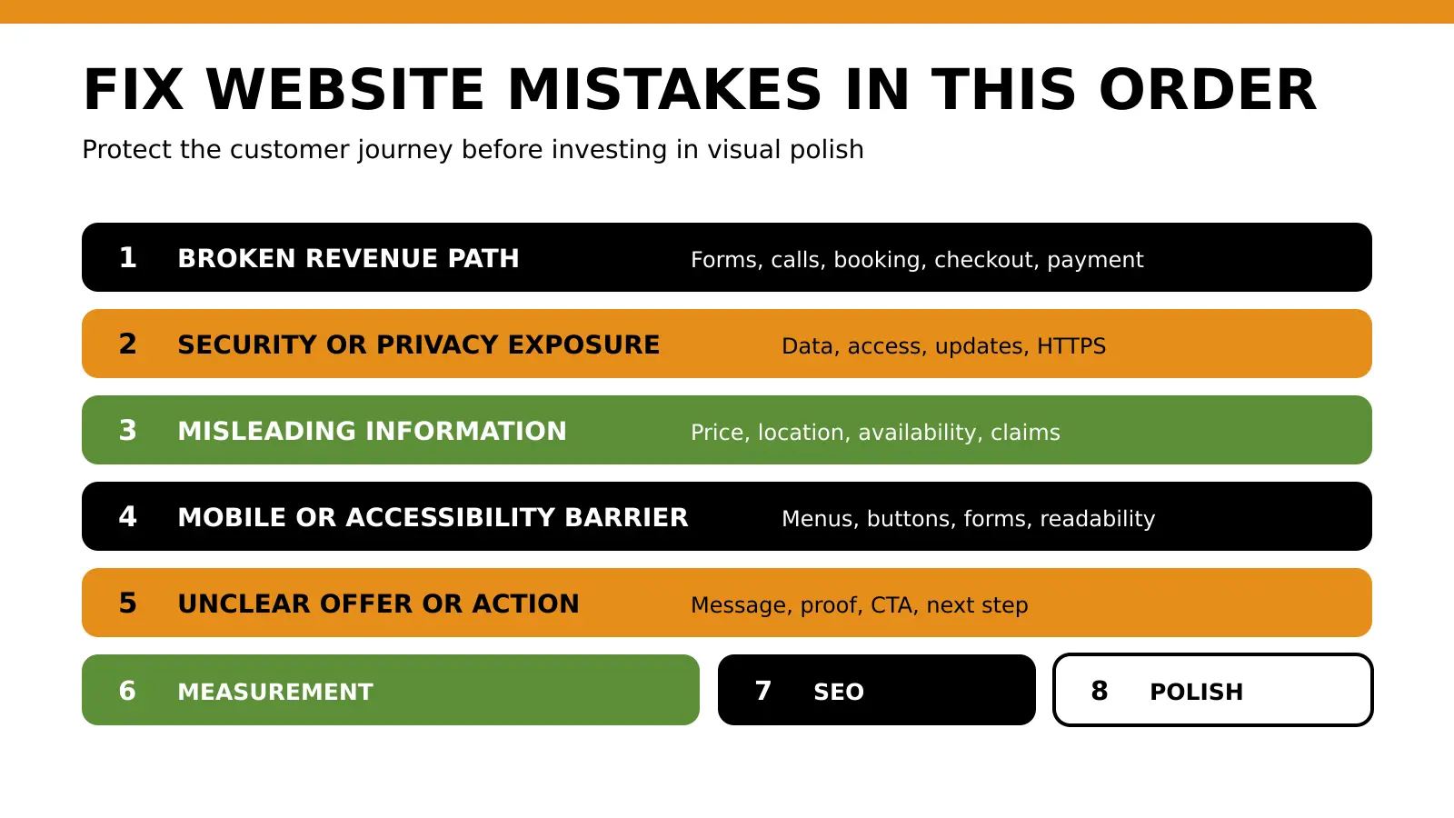
Not every problem deserves equal urgency. Use this order.
| Priority | Fix first | Why |
|---|---|---|
| 1. Broken revenue path | Failed form, wrong phone number, broken checkout, unavailable booking | Customers cannot complete the action |
| 2. Security or privacy exposure | Insecure collection, excessive access, outdated software | Creates customer, legal and operational risk |
| 3. Misleading information | Wrong price, location, availability or claim | Damages trust and creates poor-fit enquiries |
| 4. Mobile and accessibility barrier | Unusable menu, hidden button, unreadable form | Blocks real visitors |
| 5. Offer and CTA confusion | Vague message, too many actions | Suppresses response even when the page works |
| 6. Measurement gap | No reliable outcome tracking | Prevents sound decisions |
| 7. Search and content weakness | Thin pages, poor internal links, indexation problems | Limits discovery and topical authority |
| 8. Visual polish | Colour, spacing and decorative refinements | Valuable after the journey is reliable |
A simple impact score
Score each issue from 1 to 5 for:
- commercial impact;
- number of users affected;
- confidence in the diagnosis;
- ease of repair.
Use:
Priority score = (commercial impact × users affected × confidence) ÷ effort
This is a prioritisation method, not a prediction of revenue.
Kenyan business examples
Nairobi professional-service firm
Problem: the homepage lists many services, while every CTA opens the same generic contact form.
Consequence: the sales team receives enquiries without knowing whether the visitor needs recruitment, legal, financial or consulting support.
Fix: create focused service pages, add service-specific CTAs and send the selected service into the lead record.
Mombasa hotel
Problem: room information is clear on desktop, but the mobile booking widget covers the rate details and the WhatsApp button.
Consequence: mobile visitors cannot compare or complete the reservation comfortably.
Fix: test the complete mobile booking journey, simplify the first screen and preserve dates and room choices through confirmation.
Kisumu retailer
Problem: product pages show price but not stock status, delivery coverage, warranty or M-Pesa confirmation.
Consequence: customers move to WhatsApp for basic questions, and staff repeat the same answers.
Fix: publish fulfilment information, clarify payment and confirmation, and track completed orders rather than checkout clicks.
Nakuru training provider
Problem: adverts promote one course, but clicks go to a homepage containing every programme.
Consequence: paid visitors must search again, weakening message match and wasting budget.
Fix: use the relevant course page or a focused campaign landing page with dates, entry requirements, fees and application action.
Eldoret manufacturer
Problem: the site uses stock images and broad claims but shows no specifications, installation process, completed work or service coverage.
Consequence: serious buyers cannot verify capability before requesting a quotation.
Fix: add real project evidence, specifications, service areas, process and quotation requirements.
Website mistakes checklist
Commercial purpose
Message and offer
Mobile and usability
Technical reliability
Trust
Lead capture
Search
Measurement
Privacy and maintenance
Run a practical website diagnosis
Fixing a website should begin with evidence, not a full redesign by default.
Tabala Digital Solutions’ Business Diagnostic helps identify whether the primary leak is visibility, acquisition, conversion readiness or measurement.
If the current website cannot support clear service journeys, mobile usability, reliable lead capture and search-ready structure, review Tabala’s conversion-focused website development services in Nairobi.
Frequently asked questions
What are the most common website mistakes small businesses make?
The most common mistakes are unclear positioning, thin service pages, poor mobile usability, slow performance, weak trust evidence, confusing CTAs, broken forms, missing search fundamentals, incomplete conversion tracking and no maintenance process.
Why does my website get traffic but no enquiries?
The traffic may be irrelevant, or the website may fail to explain the offer, establish trust or provide a clear next action. Check traffic intent, landing pages, mobile usability, forms, WhatsApp, calls and lead quality before assuming the solution is more traffic.
Does my Kenyan business need a website redesign?
Not always. Repair the current site when the platform can support the required changes. Consider a redesign when structural limits prevent mobile usability, clear service architecture, reliable conversion journeys, technical performance or manageable content updates.
What should a Kenyan business website include?
It should clearly explain the business, services or products, intended customer, service area, proof, price context where appropriate, contact information, privacy information and the next action. Ecommerce and booking sites also need clear payment, delivery, return and confirmation journeys.
Is WhatsApp enough for website enquiries?
WhatsApp can be a strong enquiry channel, but the page should first provide enough information for a useful conversation. Use a contextual pre-filled message, manage response time and record lead quality instead of counting every button click as a lead.
How often should a business website be checked?
Check lead delivery, orders and critical errors weekly. Test forms, links, analytics and content accuracy monthly. Review search performance, service pages, security access, privacy information and conversion journeys at least quarterly and around major campaigns or releases.
How do I know which website problem to fix first?
Start with anything that blocks payment, booking, calls, forms or lead delivery. Next address security, privacy, misleading information, mobile barriers and unclear offers. Improve measurement before investing heavily in lower-impact visual changes.
Can SEO fix a website that does not convert?
SEO can increase relevant visibility, but it cannot compensate for a confusing or broken customer journey. Search, usability, trust, lead capture and measurement need to work as one system.
Summary and next step
A weak website is rarely caused by one dramatic defect. It is normally a chain of smaller failures:
- the message does not match the visitor’s need;
- the mobile journey creates friction;
- proof arrives too late;
- the next action is unclear;
- the form or WhatsApp path loses context;
- search engines cannot interpret important pages;
- analytics counts activity without connecting it to qualified opportunities or sales.
The best response is not automatically a redesign. It is a disciplined diagnosis.
Test the full journey. Repair the closest failure to revenue. Confirm the outcome. Then improve the next constraint.
Run the Business Diagnostic to identify the most likely leak before investing in more traffic or another cosmetic rebuild.
Dominate Search Results
Rankings are only high-value if they generate inquiries. Our SEO Systems turn search intent into predictable revenue. Explore SEO Systems.

Strategist Profile
Abala Tom
Digital systems strategist specializing in high-performance SEO, Google Ads, and conversion optimization. Mission: to replace marketing 'guesswork' with predictable revenue systems.